


00:00
Introduction to Motion UI Design
In today’s fast-evolving digital landscape, static interfaces are no longer enough to capture user attention. Users have come to expect fluid transitions, subtle animations, and clear feedback that responds to their actions. This is where motion UI design comes into play.
Motion UI is the practice of using animations and transitions to improve user interaction and experience on digital platforms. It breathes life into interfaces by guiding users through tasks, providing feedback, and enhancing overall usability. As noted by Adobe, motion design improves clarity and user satisfaction when used purposefully.
Whether you’re a developer, designer, student, or business owner, mastering Motion UI equips you with a powerful skill to create memorable digital experiences. This guide will walk you through the principles, tools, and best practices of Motion UI design—from simple CSS animations to sophisticated JavaScript sequences with libraries like GSAP and Anime.js.
Why Motion UI Matters: The Core Principles
Motion UI is more than just eye candy—it’s a functional tool rooted in usability and interaction design. Its primary goals are to:
- Guide User Attention: Draw the user’s eye to key elements, such as calls-to-action (CTAs) or important notifications.
- Provide Feedback: Confirm user actions, such as a button click or a successful form submission.
- Create Continuity: Use smooth transitions between states or pages to prevent user disorientation.
- Reinforce Brand Identity: Reflect a brand’s personality through a distinct motion style (e.g., snappy, elegant, or bouncy).
Real-World Examples:
- Google Material Design uses motion to mimic physical interactions—buttons ripple, cards elevate, and transitions are spatially aware.
- Apple’s iOS employs extensive motion to make interactions feel physical and intuitive, with seamless transitions between apps, screens, and UI layers.
A study by the Nielsen Norman Group found that well-executed animation can increase task completion rates and reduce user frustration. However, poorly timed or excessive motion can lead to cognitive overload and create accessibility issues.
Best Practice: Use motion with intent. Before adding an animation, ask yourself:
- What purpose does this animation serve?
- Does it guide and clarify, or does it distract?
Tools and Libraries for Motion UI
1. CSS-Based Animation
Ideal for simple UI state changes like hover, focus, or page loads.
- Benefits: Native to the browser, performant, and adds minimal overhead.
- Example:
.button:hover {
  transform: scale(1.1);
  transition: transform 0.3s ease-in-out;
}
2. JavaScript Animation Libraries
For more complex sequences and interactive animations.
Anime.js: A lightweight and flexible library, great as an entry point for timeline-based animations.
anime({
  targets: '.box',
  translateX: 250,
  duration: 1000,
  easing: 'easeInOutQuad'
});
GSAP (GreenSock Animation Platform): The industry standard for complex, high-performance animation sequences, scroll-based triggers, and advanced timing control. Its powerful plugin ecosystem includes ScrollTrigger and MorphSVG.
const tl = gsap.timeline();
tl.to(".logo", {
  x: 200, duration: 1
});

tl.to(".menu", {
  opacity: 1,
  duration: 0.5
}, "-=0.5");
Framer Motion: A popular library for creating powerful, declarative animations within React applications.
Lottie: A library from Airbnb that allows you to render animations exported as JSON from Adobe After Effects, enabling complex vector animations on the web.
3. Prototyping Tools
Essential for designing and testing interactions before development.
- Figma (Smart Animate)
- Adobe After Effects (with the Bodymovin plugin for Lottie)
- ProtoPie or Framer
4. No-Code/Low-Code Platforms
Many website builders offer built-in motion design tools.
- Webflow: Features a robust timeline UI for creating custom interactions.
- Elementor (WordPress): Provides various motion effects and animations.
- Wix Studio: Includes built-in motion presets for easy implementation.
Configuration and Setup
Basic HTML/CSS: Start with a simple HTML structure and CSS for styling and basic transitions.
HTML
<div class="cta">Sign Up</div> CSS
.cta {
  background: #28a745;
  padding: 10px 20px;
  color: white;
  transition: transform 0.3s ease;
}
.cta:hover {
  transform: scale(1.1);
}
Integrate JavaScript Libraries: Add libraries to your project via a CDN for quick setup or install them using a package manager for more complex builds.
CDN:
<script src="https://cdnjs.cloudflare.com/ajax/libs/animejs/3.2.1/anime.min.js"></script>NPM:
npm install gsapOptimise for Performance:
- Animate
transformandopacityinstead of layout properties likewidthortopfor smoother performance. - Use
requestAnimationFramefor custom JavaScript animations. - Compress assets (SVGs, images, JSON files).
- Lazy-load large or non-critical animations.
Development and Customisation
Start by mapping the user’s interaction flow and identifying where motion can add value. What feedback does the user need? What micro-interactions can improve clarity?
Examples of Micro-Interactions:
- Hover effects on buttons and links.
- An “error shake” animation on an invalid form input.
- Animated loading spinners to indicate progress.
- Expanding cards that reveal more information on click.
CSS Keyframe Example: Fade-In Animation
@keyframes fadeIn {
  from { opacity: 0; }
  to { opacity: 1; }
}
.element {
  animation: fadeIn 1s ease-in forwards;
}
GSAP Scroll-Triggered Example:
gsap.from(".hero", {
  scrollTrigger: ".hero",
  opacity: 0,
  y: 50,
  duration: 1
});
Motion UI Design Checklist
- Define Purpose: Every animation must have a clear goal.
- Choose the Right Tool: Use CSS for simple tasks and JavaScript for complex logic.
- Prototype First: Test interactions in tools like Figma or Framer.
- Optimise for Performance: Aim for a consistent 60 fps.
- Ensure Responsiveness: Test animations on all target devices.
- Align with Brand Identity: Ensure motion reflects the brand’s tone.
- Be Accessible: Respect the
prefers-reduced-motionsetting to disable non-essential animations for users who need it. - Avoid Overload: Use motion selectively. Limit the number of complex animations happening at once.
Bonus Tip: Use the @media (prefers-reduced-motion: reduce) media query in your CSS to disable or tone down animations for users who have enabled this accessibility feature in their system settings.
Key Objectives of Motion UI Design:
Motion UI design principles go far beyond simple transitions and animations. The most effective motion in UI is subtle, purposeful, and deeply integrated into the design language. Below are specific and minute details that practitioners of Motion UI pay close attention to, categorised by principle:
1. Purposeful Motion
Details:
- Avoid gratuitous animation: Animations must serve a functional role, such as indicating a change of state or helping users understand spatial relationships.
- Microinteractions: Tiny animations like a button ripple or heart bounce after liking a post confirm action, often in under 300ms.
- Guided Focus: Subtle fades or slides direct the user’s attention to what’s important without overwhelming them.
- Avoiding overuse: Never animate all elements on screen simultaneously. Stagger or sequence them to retain hierarchical clarity.
2. Timing & Easing
Details:
- Duration sweet spot:
- 100–200ms: For small UI elements (e.g., button press, toggle).
- 300–500ms: For larger movements (modals, page transitions).
- Easing curves:
ease-in: For elements entering the screen (starts slow, ends fast).ease-out: For exits (starts fast, ends slow).ease-in-out: Best for symmetrical interactions like card flips.- Use custom bezier curves for brand personality. Example: Material Design uses
cubic-bezier(0.4, 0, 0.2, 1).
3. Continuity & Natural Movement
Details:
- Anticipation & Follow-through:
- Anticipation: A slight shrink before expanding a card.
- Follow-through: A UI panel might overshoot by 5–10px before settling.
- Object permanence:
- Keep elements in visual memory. If a list item expands, it should do so in place, not vanish and reappear.
- Maintain spatial relationships:
- Transitions must reflect spatial logic (e.g., slide from right = next; left = back).
4. Visual Hierarchy
Details:
- Staggered animations: When multiple items enter, delay each by 50–100ms to reflect importance/order.
- Opacity vs. motion:
- Fade (opacity) alone is less noticeable than motion. Combine with slight movement (e.g., 5–10px slide) for more clarity.
- Scale subtly:
- Avoid scaling over 1.1× to prevent distortion. Use very small zooms (e.g.,
scale(1.03)) to draw attention without breaking the layout.
- Avoid scaling over 1.1× to prevent distortion. Use very small zooms (e.g.,
5. Responsiveness & Interactivity
Details:
- Hover animations:
- Should complete within 150ms. Slow hover responses feel laggy.
- Touch feedback:
- On mobile, show immediate feedback (e.g., press states) within 50ms.
- Interruptible animations:
- Users must be able to override animations by interacting—don’t lock them into waiting.
- Reduce motion preferences:
- Respect system settings. Use
@media (prefers-reduced-motion: reduce)to simplify or eliminate animations for accessibility.
- Respect system settings. Use
6. Cognitive Load Reduction
Details:
- Predictable patterns:
- Keep consistent direction (e.g., always slide modals up/down).
- Progress indicators:
- Use looping animations or pulsing dots to signify background activity.
- Avoid distraction:
- Background animations (e.g., floating particles) should be slow (10+ seconds per loop) and low opacity to avoid stealing attention.
7. Brand Personality Through Motion
Details:
- Tone reflection:
- A fun app might use bouncy easing (
spring) while a finance app uses smoother, formal transitions (ease-in-out).
- A fun app might use bouncy easing (
- Consistent motion vocabulary:
- Define reusable motion components like
card-slide-in,button-pop, etc., as part of a motion system.
- Define reusable motion components like
Testing & Evaluation
Details:
- Use slow-motion testing:
- Inspect animations frame-by-frame to check for jank, improper easing, or unintended z-index shifts.
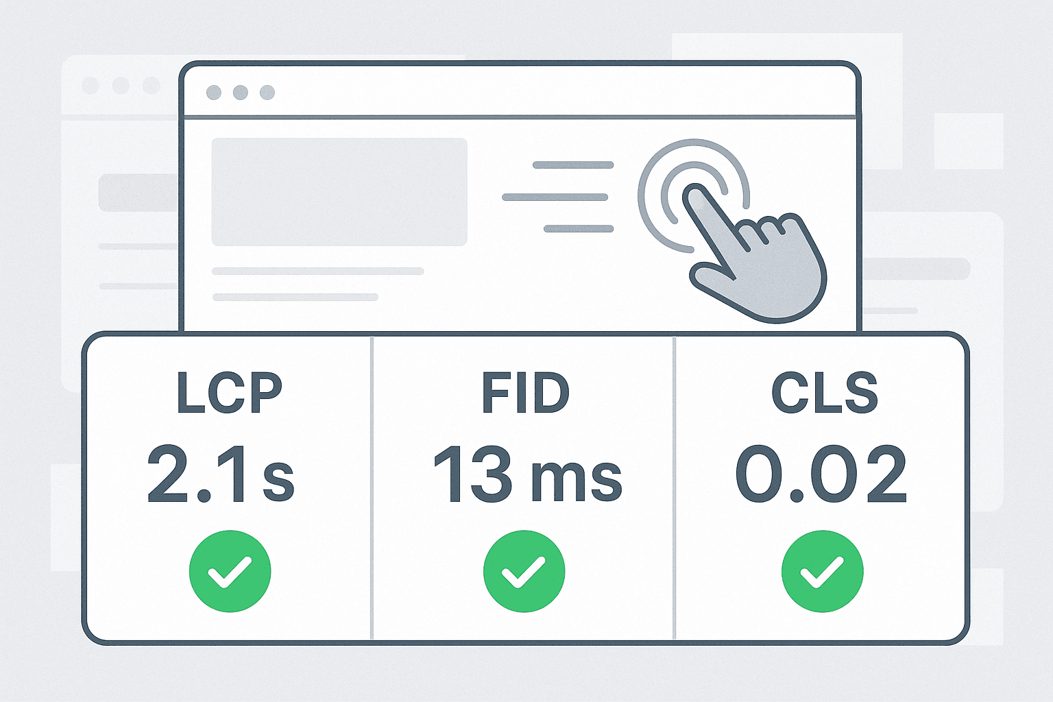
- FPS and performance:
- Aim for 60 FPS animations. Use tools like Chrome DevTools Performance tab to track paint time and layout shifts.
Conclusion: Elevate Your Website with Motion UI
Motion UI is no longer optional—it is an essential component of modern, user-centric web design. When used with purpose, animations can guide, delight, and convert.
- Developers can create powerful, dynamic experiences with libraries like GSAP.
- Designers can prototype polished interaction flows in Figma or After Effects.
- Business owners can improve user retention with interactive storytelling.
Start with subtle transitions and expand your skills as you grow more comfortable. By focusing on performance, consistency, and clarity, your use of Motion UI will not only look good, but it will also feel intuitive and satisfying to use. Reach out to us if you need help.
Recommended Resources on Motion UI Design
- Tutorials: GSAP and Framer Motion tutorials on YouTube
- Article: “Motion Design in UX” on UX Collective
- Assets: LottieFiles for free and premium animation assets
- Tools: Framer Playground to experiment with React-based animation